Work Highlights
Wegmans Retail Pricing Tool
The Pricing Tool is the engine behind every price tag, discount, and deal — powering pricing, coupons, promotions, and loyalty customized at both item and local store level.
Overview
Revamp existing legacy pricing tool to consumer-grade experience web application that enables analysts to seamlessly price and coupon 100000+ products by eliminating multi-step, repetitive, and distributed system processes and ensuring their tasks are streamlined and optimized into one system.
The achievement lies in the successful reception of our designs and implementation by users, following two previous failed revamp attempts by different agencies.
Although I'm unable to disclose specifics due to NDA, please explore the work highlights below. Feel free to reach out to me for further details.
My Role
- Own research
- Design Library or system
- Lo-Hi Fidelity wireframing and prototyping
- Design handoff
- Work with Technical trade-offs and get buy-in from stakeholders for better UX
Collaborations
- Stakeholders, SMEs, Product Managers, Solution Architects for User Research, Requirements gathering, Usability reviews, Roadmap planning and prioritization, etc.
- Developers and other technical managers for nuances, use cases, trade-off identification, and handoff
Process

Outcome and Impact
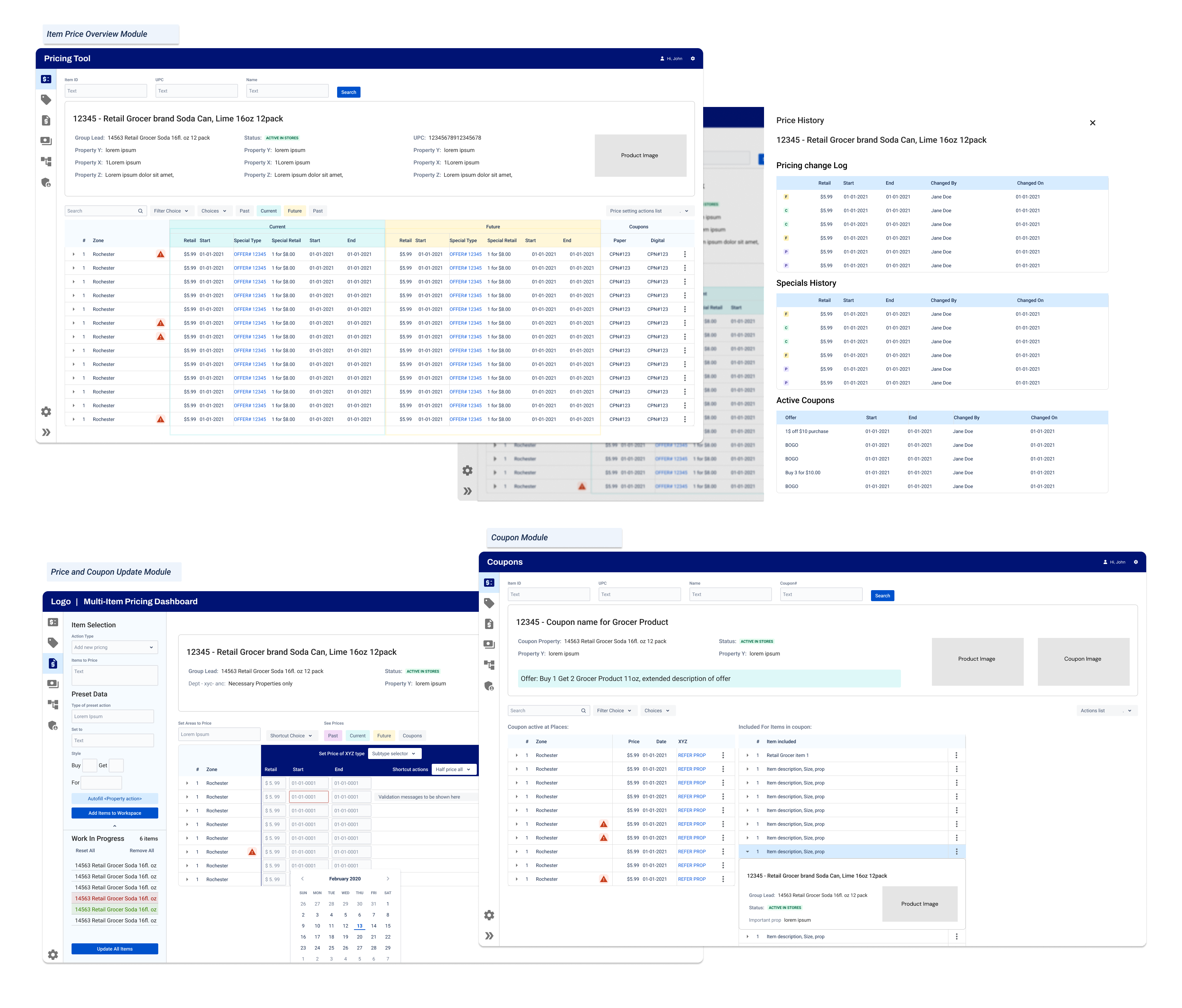
1. Pricing and Coupon Overview
Goal
- Help all Pricing Analysts get a comprehensive picture of an item's current, future, and past price as quickly as possible
- Allow analysts to run faster price investigations on a single platform for real-time in-store discrepancies
- Modularize the item's basic information to be used across multiple platforms
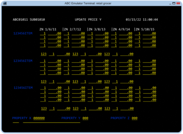
Current State
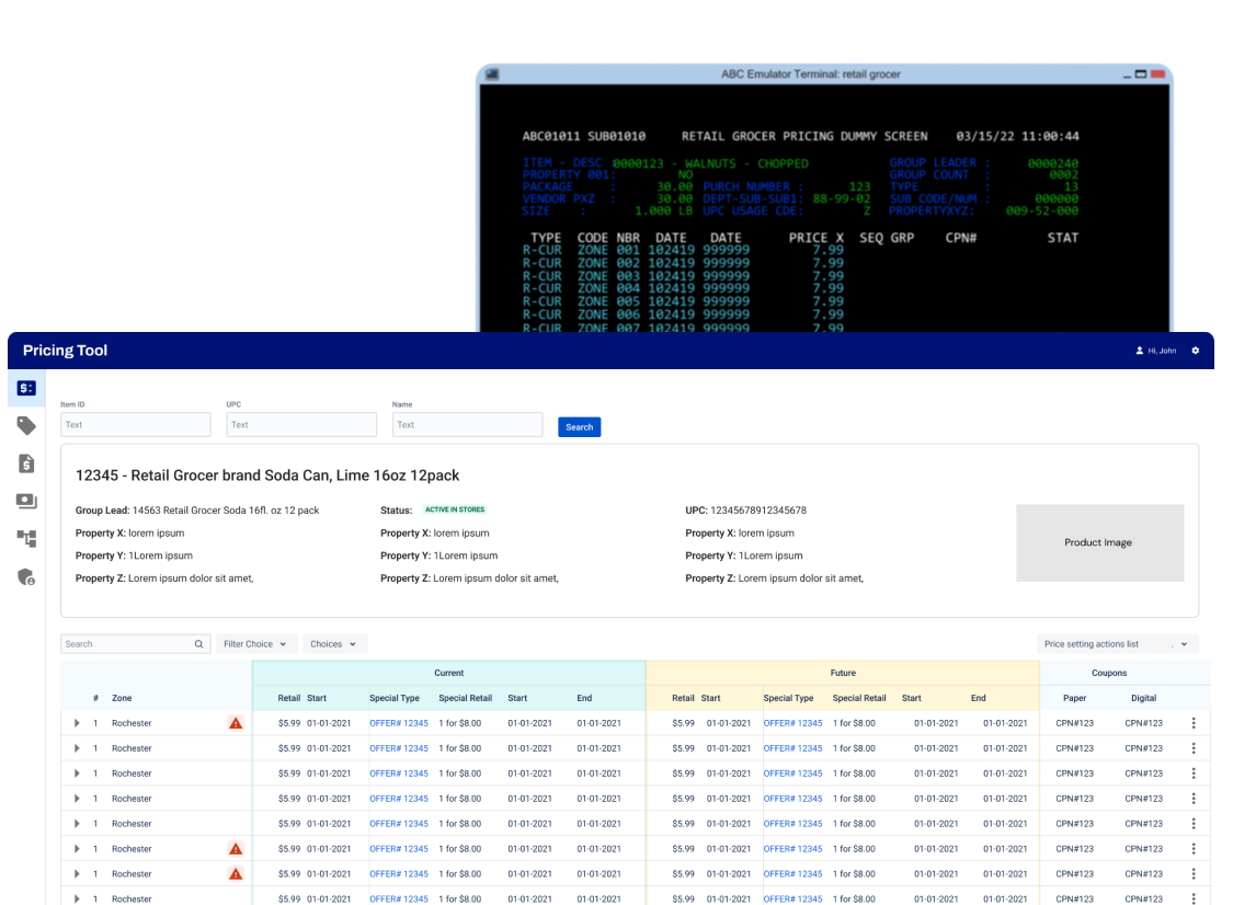
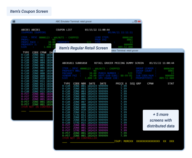
- Multi-screen workflow to understand the complete status of an item's price, promotions, and coupons.
- Coded information in alphanumeric or color making it hard to read
- Log like dump of prices at stores
Impact
- All roles dealing with item prices can search and read pricing information without needing expert knowledge to decode and learn symbols
- Required data on a single screen for all tasks related to item prices eliminating note-taking and complex workflow for following data across multiple screens
- Faster reading of data with improved readability and Information Architecture where data reads like users' mental model
Outcome
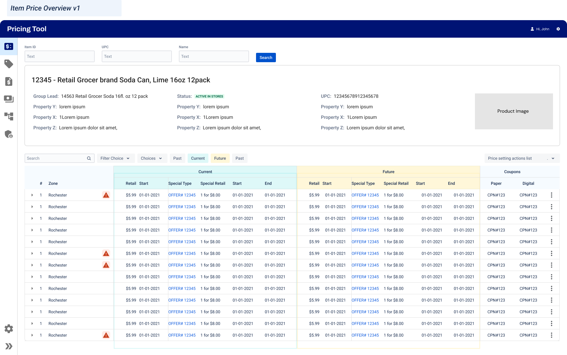
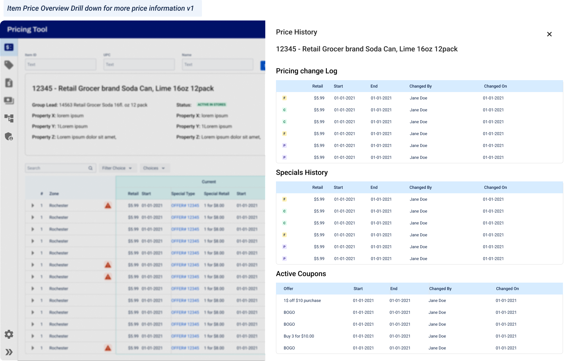
Note: These wireframes are purely representative and use obfuscated data. They are not reflective of the final product.
For more detailed case study reach out to me at nea.patil.02@gmail.com
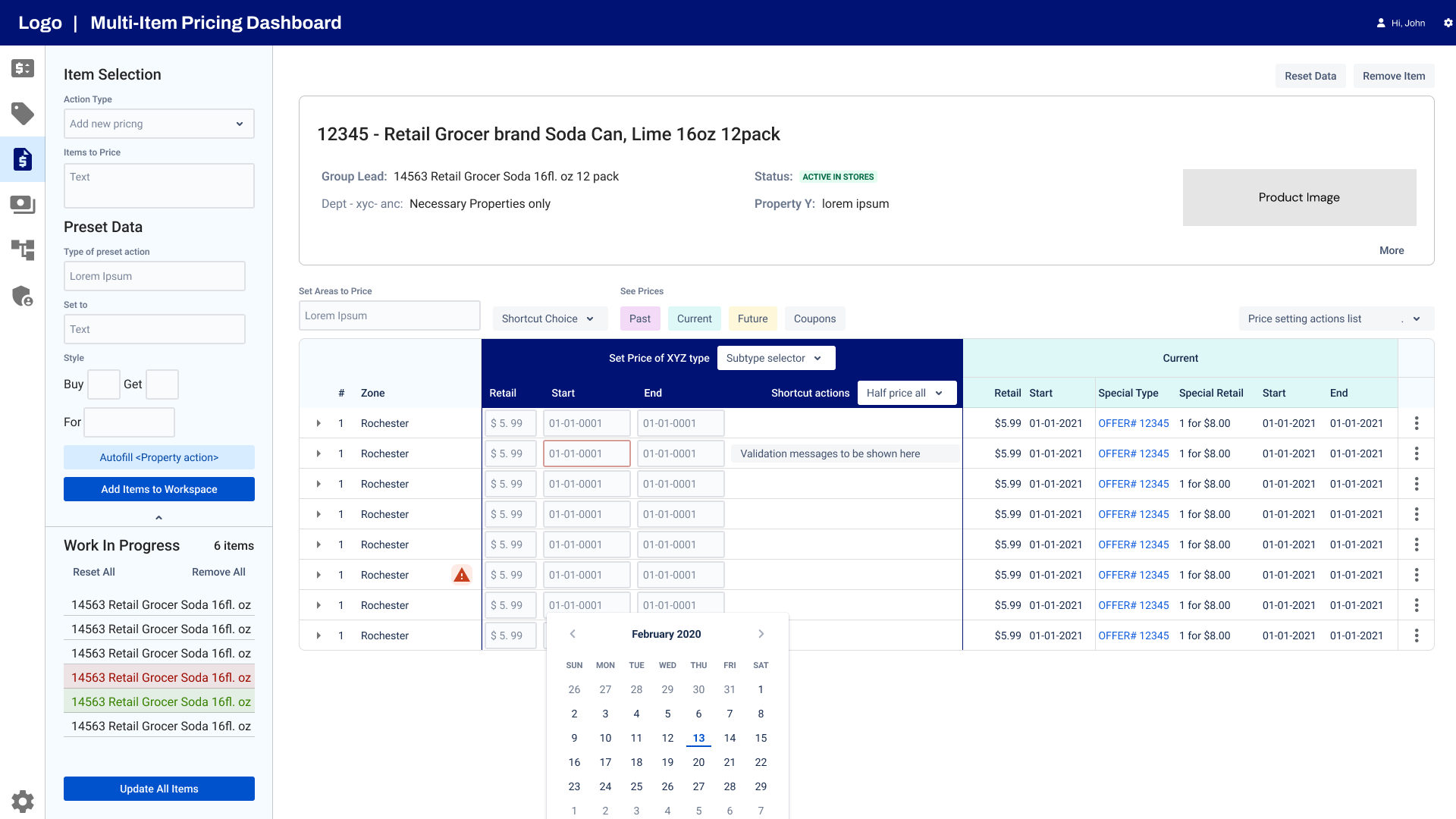
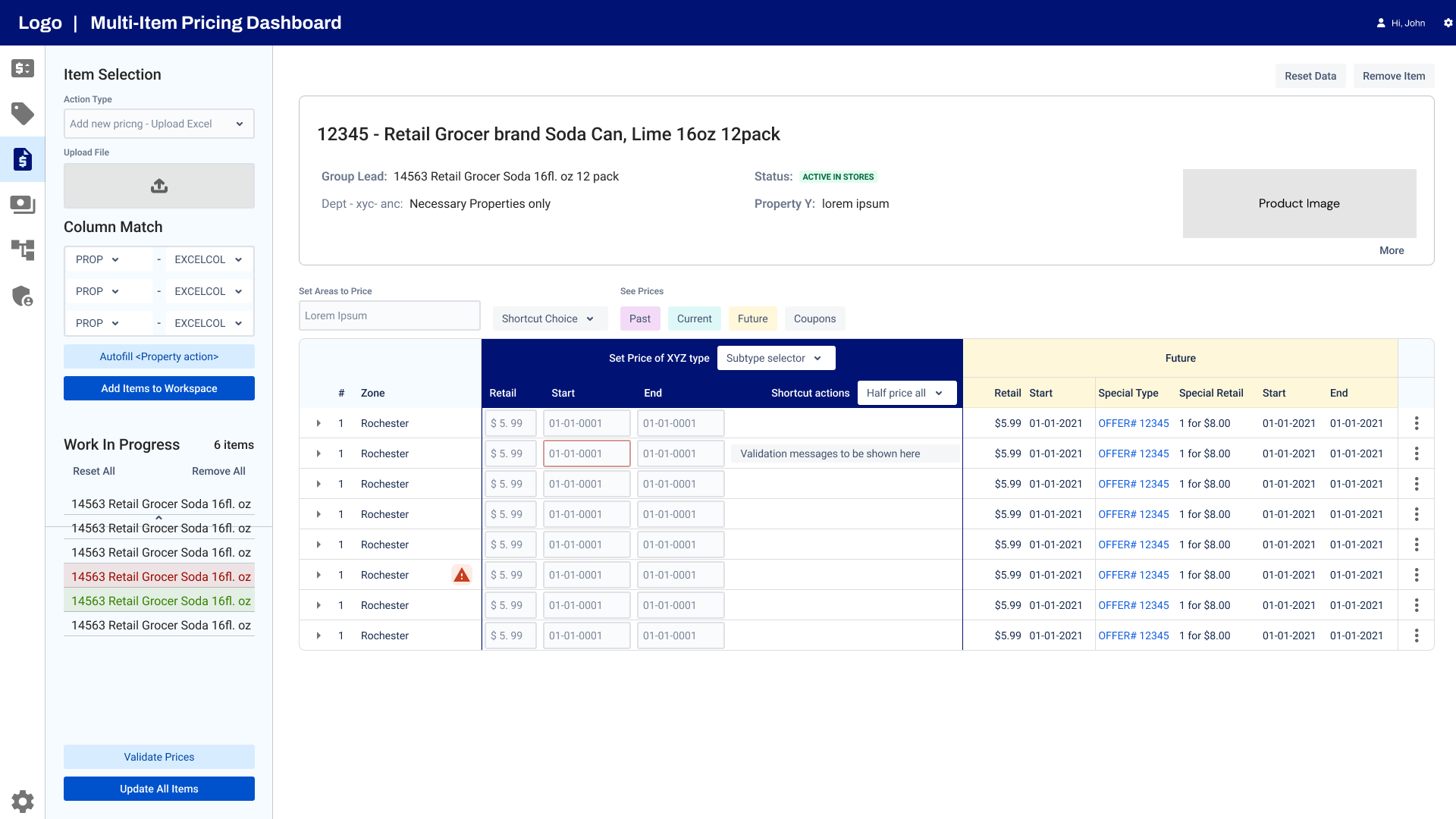
2. Multi-item Pricing Dashboard
Goal
Faster and accurate multi-item pricing and offers of items with no repetitive manual actions, a fully keyboard-accessible UI, and upload of prices
Current State
- Manual entry of each item and its pricing without any helpers of what you are pricing
- No live error handling, system takes hours to process a CRUD and errors are posted to a different screen
- No business rules are integrated into the system
Impact
- Eliminated over 80% of manual repetitive steps while setting prices and offers of items by automations, better UI and upload of prices
- Improved accuracy by providing better data visibility
- Eliminated dropping of price edits by the backend system by improved error handling, business rule handling, etc.
- Providing shortcuts and intuitive automations for price setting improved accuracy and performance
Price update screen
Note: These wireframes are purely representative and use obfuscated data. They are not reflective of the final product.
Outcome
Note: These wireframes are purely representative and use obfuscated data. They are not reflective of the final product.
For more detailed case study reach out to me at nea.patil.02@gmail.com
Discovery
50+ interviews
and demo sessions spanning across 12+ departments and roles over 15+ stakeholders and SMEs were iteratively conducted to gather information about :
- Top Tasks
- Infrequent but critical tasks
- Roles and responsibilities
- As-is workflows
- Pain points, wants, business, and user needs, knowledge gaps
- Building relationships with users assuring that we are listening to you and will work towards what you need
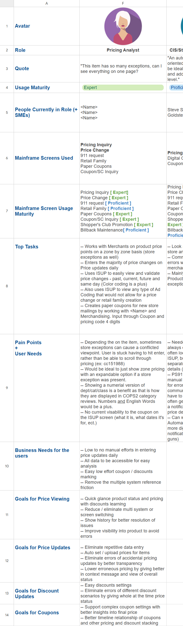
Persona Library
Built in collaboration with an SME and Business Analyst based on the interviews and demos conducted.
It was iteratively updated while we conducted discovery for each module after initial take-off discovery where we identified user groups and roles and responsibilities.
What we tracking in the persona library :
- Overall Usage Maturity and module-based usage maturity
Why? It allowed us to track users' comfort and familiarity of product and tasks organization-wide. Also informed important design decisions and priorities, scope for MVP verses upcoming upgraded versions and plan roadmap. - Top Tasks
- Pain Points
- User Wants
- Business Needs for the Users
- Goals per module
User Insights
From the the interviews and screen audits I synthesized pain points and needs.
Legacy feature favourites
Significant users were experts from the old system, and had rejected adoption of new tools before. To avoid this I gathered some insights on features they would love to carry over.
1. Color coding data
Users wanted to maintain the color codings even though they may seem redundant because their eyes were trained to find data quickly on screen without having to read.
2. Keyboard accessibility
The legacy system allowed users to use only the keyboard with expert shortcuts. Newer tools meant frequent switching between mouse and keyboard which was time consuming.
Pain Points
1. Distributed information systems
Missing contextual identifiers, information critical to decision making, processing, etc. in old system led users to have multiple windows and systems open and undertake sub-tasks to uncover and led to delays and errors
5. Physical artifact dependency
Over decades to address missing functionalities users developed physical artifacts to tackle it. eg. Wallet calendars for week numbers, post its for frequent item IDs.
2. Dated and Bandaged UI over decades
Since the legacy UI is old, new employees found it extremely difficult to learn and operate it. Inconsistency in information architecture and data elements over the system due it being a bandaged legacy system proved it to be very taxing for users to identify and understand it each time
6. Operational Inefficiency
All tasks involved manual data entry with minimal automation, assists, and consulting distributed systems for data, most basic tasks turned into complex and time-consuming tasks requiring user to block off large chunks of their work time to accomplish them rather than focus on decision and research tasks.
3. No error prevention, Poor handling and recovery
Due to limited screen space and processing, errors in data modification were encoded, or not shown, Users learned of failures through lengthy investigative processes.
7. Poor access control
With no password and just char based identifiers to sign on, it provided no security to users and their actions. Most users had access to all data and actions even outside their role, leaving the system with poor control over price data modifications.
4. Poor Data Transparency
Due to screen size limitations of 3270, most data is in codes or abbreviations, or contextual data is missing, or not reflecting the correct object status. This leads to adding verification, prevention, and investigation tasks for users.
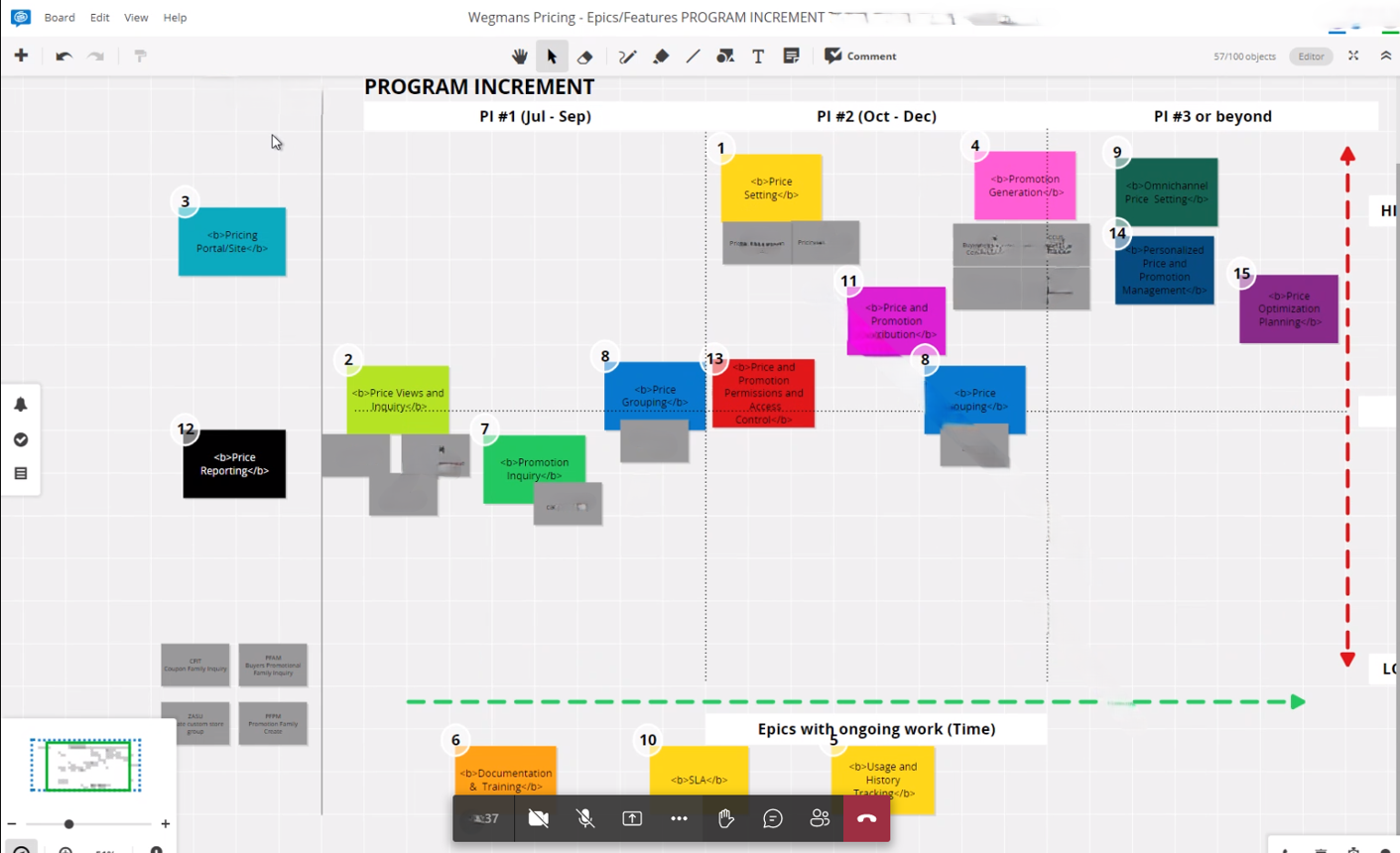
PI and Roadmap Planning
Based on the knowledge gained in discovery, collaborated with Product management, stakeholders, Technical team, and managers to advocate for UX priorities during Program Increment and roadmap planning for features.
Points of Discussion
- What could be MVP features?
- Which features are foundational? Can the timeline be sequenced to build them first?
- Highlight critical features in future to lay groundwork
- What components can we build that maybe reusable or can be integrated into future features?
Design Tokens, Library and Patterns
Since Wegmans internal tools did not have a consistent UI with standardized branding, I built a design library with patterns for complex data tables and how user actions interact with data tables.
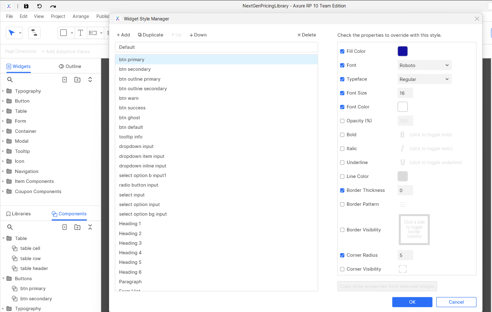
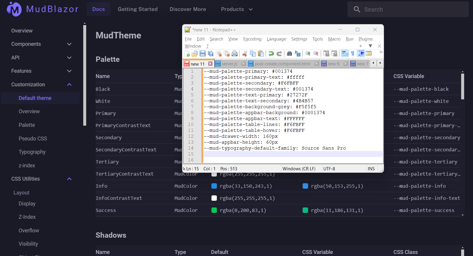
Design Library Sync with Developers
To ensure maximum consistency between designs and the final product, I collaborated with developers to define the specs CSS Variables of our UI component Library Mudblazor which provided us with basic out-of-the-box components.
Developers built a Wegmans UI Component page with samples and code snippets to ensure consistent usage and library maintenance.
This approach increased our speed of development with consistency. New components that needed to be added had a low overhead of design dependency.
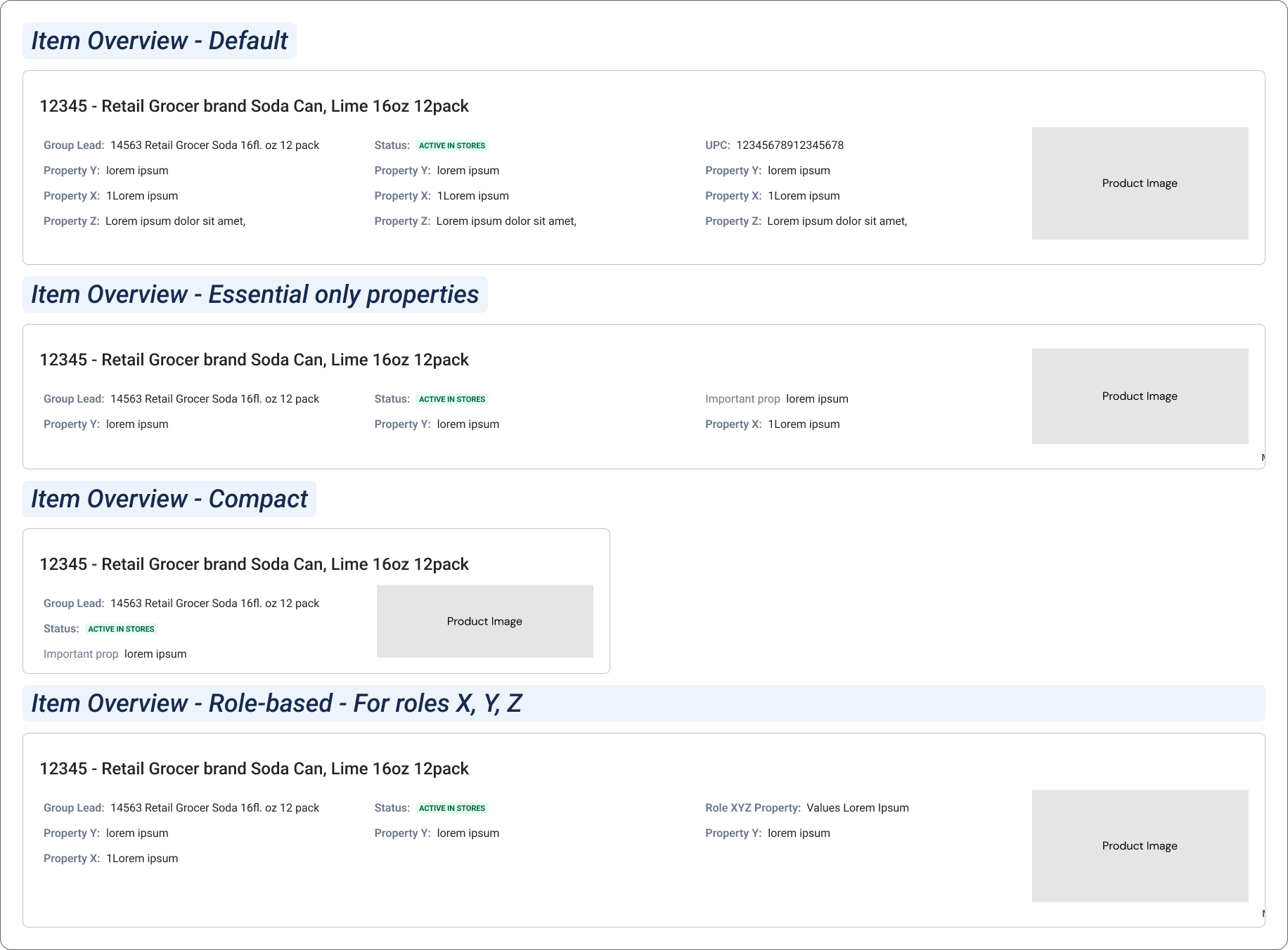
Modularize Framework
After auditing and analyzing the content on old screens, I created a IA with modularized components for each information needed. This was done to standardize how information is displayed across current application and across other web apps where these will be needed.
Neha Patil
UX Researcher & Designer