Savi Topic Profiles
Designed a web-based decision support tool that empowers people and organizations of Indianapolis with the information they need to make an impact on communities
Role - UX Designer & Researcher
UX Research - 5 Contextual User Interviews, Focus groups, User Testing, Surveys
UX Design - Low and High fidelity prototypes, Wireframing, Web development
As a sole UX Designer, I created new usability testing protocols and improved surveying techniques which were widely appreciated by stakeholders. Independently conduct usability testing. Collaborated with developers to design and develop features in accordance with technical constraints.
Team
Collaborated with 1 Information Designer and 2 Developers
Tools
Adobe XD, Photoshop, Html, CSS, Javascript
Nov 2018 - Feb 2019
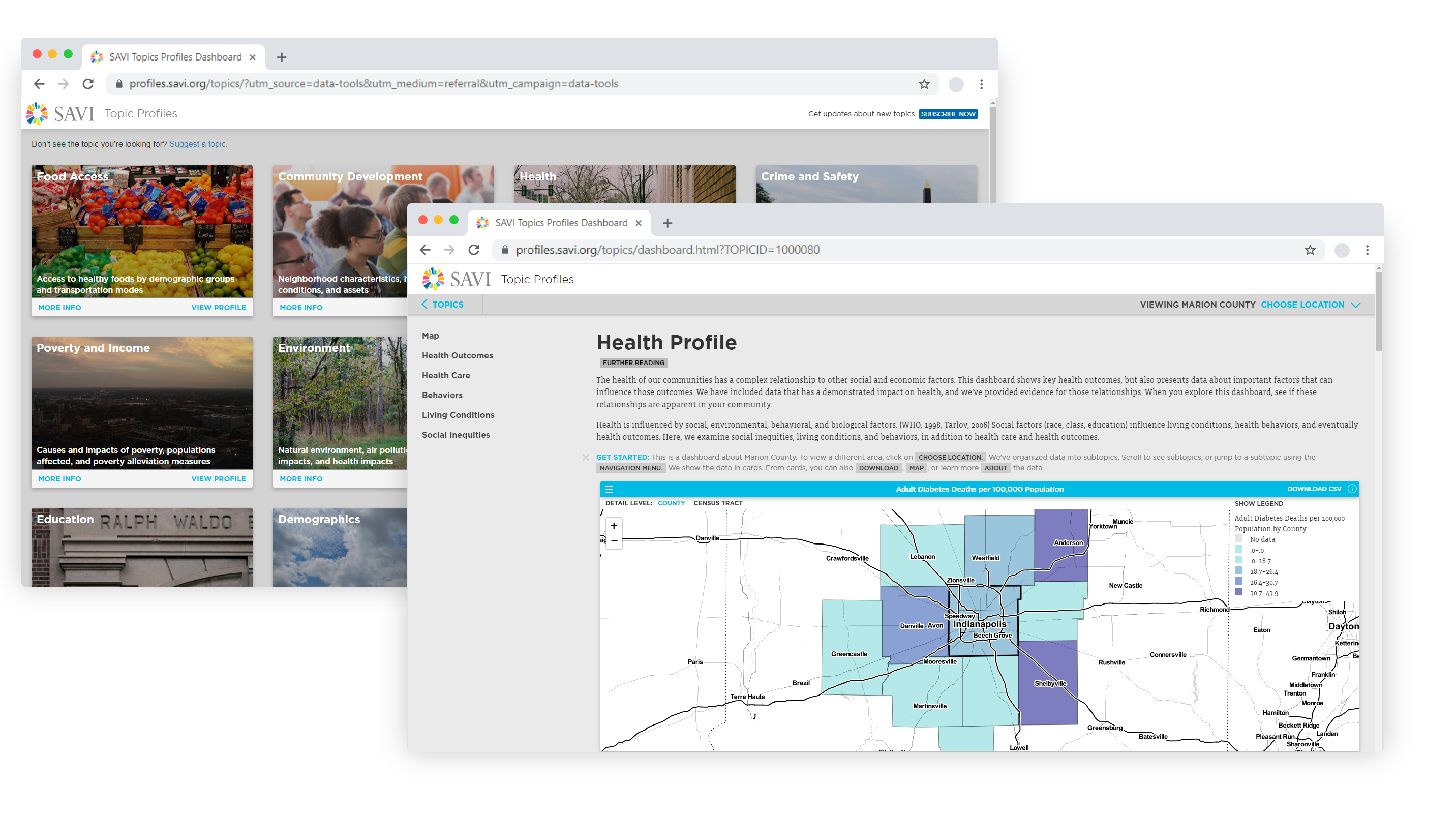
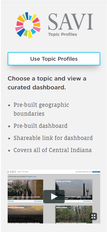
What is Savi Topic Profiles?
Savi is a leading Community Information System provider in Indiana that empowers people and organizations to make data-informed decisions that ultimately improve the quality of life in the communities they serve. Topic Profiles, a concern based curated dashboard, is one of three-parter Savi ecosystem.
Problem
Savi had launched the Community Profiles dashboard a month ago, but during usability evaluation realized many people were unable to use it to its fullest potential due to its complexity. We analyzed these issues and set out to design an analytical Topic Profiles dashboard which is
- lucid and less daunting in allowing users to analyze data
- boosts trends and insights discovery
- gives users the right amount of control over customization
- supports their decision making and community targeting process
so that we can expand our user base which in turn would help make larger impact on communities.
Process

Outcome
Successfully built an intuitive dashboard that exceeded stakeholder expectations
"This is an exceptionally cool site. It uses data to dynamically tell the "big picture" about an area. Great job!"
An intuitive dashboard that has helped numerous organizations in Indianapolis establish target-based community funding and programs.
For example, Savi helped the County Public Health department in successfully targeting their limited resources towards specific communities to limit the spread of infectious diseases.
For any ordinary person, large amounts of data are daunting.
Most people find it confusing to explore and operate data dashboards. They often get overwhelmed by the large amounts of data displayed and get lost when understanding the complex relationships of data points.
Simplicity was key to curate the user experience of this dashboard. We used extensive User Research and Evaluative Research to guide our approach.
Objective
Create a simple, understandable, less daunting analytical dashboard information system
Process
Stakeholders revealed that their organizations struggled with dashboards and failed at integrating findings into their tasks. To understand why we conducted User Research.
Interviews and focus groups with stakeholders and users
Over the course of a few weeks, we conducted user interviews and focus group meetings. We tried to put ourselves in the users’ shoes. We gathered their need for the product and the tasks and goals in their work and also ones related to the product. From this, we uncovered pain points of current dashboards, different features they needed to assist their tasks better.
Insights
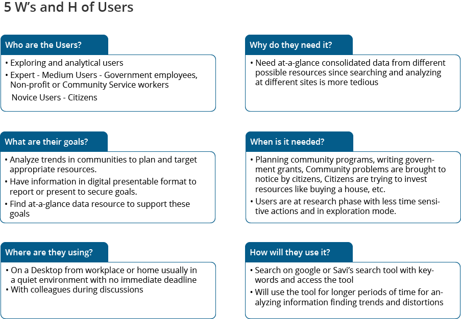
- It was clear that almost all of them were not tech-savvy people
- Majority of the users were of 35-60 years old
- They needed a flexible system to compare trends between different communities
- Community (geography) selection like Counties, zip codes, etc. differed with tasks at hand
- After analyzing trends they needed to report on findings and needed digital presentable version of data preferably images
- Trustworthy data was of utmost importance which they can establish by knowing its source
Synthesis
I synthesized the notes from these interviews and prepared a guide to the context of our users to help us understand them better and use this knowledge in further design and evaluation processes.
Understanding the basics of the user
Creating a rough Usage based task and data artifact flow of users
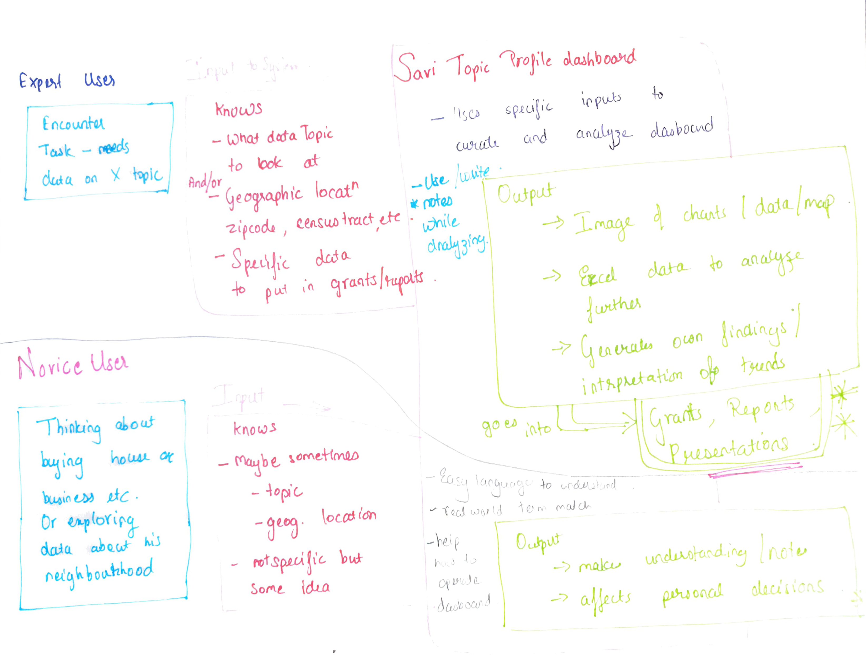
Building a Users Mental Model to better match it for a fluid effortless experience
Taking a step back to understand the before and a step forward to understand the after as well to better understand the dimensionality of the problem

I Created a Design Strategy to guide our design process
- Simple, lucid information and actionable items
- Reduce the cognitive load to avoid excessive note-taking
- Less daunting more calming appearance
- Easy user flow from summary to details of topics
- Provide simple context information with sources
- Ease yet flexible flexible action of setting desired geography
Defining the Problem
and splitting it into small actionable pieces
We identified various issues to tackle during our user research. Some were also derived from the usability evaluations we ran previously for Savi's other similar dashboards.
User Workflow
How a user will navigate through topics in the dashboard
- Topic Selection and navigating to the dashboard
- Dashboard layout and navigation
- Geography Selection
Goal: Design an easy intuitive simple dashboard user flow that helps users select topic which they need, find relevant information in it, and provide the flexibility and ease to select and switch between the communities of their interest.
Data Display And Usage
How a user will analyze, interpret and use the data
- Data visualization display in card
- Functionality options for data card
- Download of data
- Trust of a user in data
Goal: Design simple data visualization cards that allow users to interpret information, have less load on memory to remember data, and make access and download of required assets easy.
Design Sprints
To tackle different sets of problems and test alternatives we designed in multiple sprints. Each sprint had its own dedicated brainstorming, prototyping and feedback sessions.
Why Sprint? We decided to tackle problems one by one to involve our stakeholders in our design process and get immediate feedback so that we had enough time to make revisions before handing it to the development team.
Design Sprint 1 - Designing the User Flow
Ideating
My supervisor and I gathered in a room for a whiteboarding session. We had put our list of problems seen during research on the board. We had explained to each other our paper sketched ideas. We discussed the pros and cons of each flow.
From our research, we knew users wanted the ability to change dashboard data dynamically on the same page as per different community area selection(geography selection). We ended up with 2 top contenders for this varying in the flexibility of how the would allow changing geography. One was high dynamics and flexibility and other one moderate with more focus on action at hand.
We made quick paper prototypes of these 2 workflows.
I Prototyped the two versions of User Flow, allowing users different level of flexibility to change their selected neighbourhood.
Design A
Design B
Usability Testing
Revealed that Design B struck the right balance of flexibility and robustness, while Design A was too confusing.
We decided to test these prototypes with our stakeholders in a focus group style hour-long meeting. This meeting was originally scheduled as a progress report meeting, which we decided to use as our quick feedback session for our designs.
How? We strategized the meeting with the first few minutes as a status update, then present Design A and get feedback. Then present Design B and gather reactions. And then ask them to compare both by voicing their thoughts on them and then voting their preferences.
With Whom? Our audience comprised of 2 government officials from different branches of urban planning and legislature, 3 NGO managers, 1 professor from IU School of Public Health and 1 data analyst from Polis Center.
The meeting was led by my supervisor while I assisted by observing and noting their reactions to prototypes, discussing and probing their thoughts.
Design A
"When I saw 2 maps side by side I was initially confused and overwhelmed"
"I was stuck when both the maps were open I couldn't scroll down to data, I kept zooming into map"
"The map for selection is very tiny and difficult to navigate into"
"I don't see a case where we will need a map parallelly to compare that quickly, we usually have a specific area we like to completely study so Design A suits better"
Design B
"Looks very clean and found it easy"
"Lets me focus on my analysis"
Other Comments
"I like the navigation menu, lets me know the topics"
"In description of topics I would like to know the source as well, while writing grant I need to know if it is trustworthy information or not"
"Looks simple and professional"
We decided to move ahead with Design B as it got the most positive reviews
Design Sprint 2 - Improving the Data Display and Functionality
Ideating
We ideated on other problems discovered during user research, which were related to the data cards.
Prototyping
Improving Data cards menu for easy access. Worded menu for quick access and understanding of output.
Guiding steps easily available to help new users and less tech-savvy navigate the dashboard.
Listing Sources of information to generate higher trust amongst users for the data.


Usability Testing of the entire system revealed that the dashboard system fit perfectly in the user's tasks and they did not face much difficulty while using it.
Contextual Usability Testing + Survey
I conducted contextual usability testing with 5 users where they were typically asked to perform their regular tasks wherein they would require to use the dashboard while thinking out loud. I created an open-ended testing protocol for this. I also asked them a few questions about what other typical tasks did they see themselves performing, what kind of data do they bring as input and expected output and their overall feeling about the dashboard.
Since a number of our users and stakeholders weren't able to match up to our schedule we decided to simultaneously send out a usability survey to them.
Why Contextual Inquiry?
To observe how they work and interact with the dashboard in their environment.
To confirm and observe the seamless integration of dashboard into tasks by the inputs they come with to the dashboard and the outputs desired to fit in their task at hand.
Why Surveys?
To get quick feedback without having to wait or conduct numerous Contextual interviews especially when users are not easily accessible.
Outcome
- "clean, organized, simple"
- "Very visually appealing...invites the user to interact"
- "the way the data is organized because it will make my life much easier"
- "The look is inviting and not intimidating"
We learned a lot from the tests; not only did we accomplish our goals, but we were able to improve and ease our users workflow a lot by this dashboard design. We were also ecstatic to learn that most of our stakeholders and users were excited to play around the dashboard to get more insights on data of their interest.
Feedback was so good that we used this design pattern was replicated to implement a similar Dashboard Information System.
The positive feedback from stakeholders and users alike led this project to be released onto Savi's website as an open public data dashboard.
The design of this dashboard garnered so much success that we were able to implement a similar design pattern for our next oncoming Population Profile dashboard as well.
Working with Developers
During this project, I worked collaboratively with our developers by ensuring we had a great communication channel. I consistently consulted with them regarding what can be implemented, what are our dashboard refresh response rates, how would they affect our users' responses and actions. I also supplied UI specs and code changes for minor UI fixes.
While implementing the download data as image option since we were short-staffed I rose up the chance of flexing my coding skills. I was able to successfully implement download data as image option using javascript and libraries.
Collaborating with Stakeholders
Getting quick or detailed feedback directly from stakeholders helped make data-based decisions rather than assumptions which could be harmful in the long run.
Talking to various stakeholders understanding their different work environment and tasks, help curate the product seamlessly into their tasks.
Mobile Designs
From Google Analytics we saw that we do not have even a few mobile users for our previous dashboards, but we still decided to keep all our dashboards Information Systems responsive and compatible with mobile.
Since we do not have many mobile users we decided to keep the mobile web page similar to desktop without much modification to avoid users getting confused.
Following are a few prototype Design I designed under the guidance of my supervisor.
Neha Patil
UX Researcher & Designer