Designing Viaero's
Checkout Experience
Viaero’s overall web presence and checkout experience is plagued with platform fragmentation causing broken strenuous cross-platform interactions, lack of information architecture, and inefficient journey for all tasks.
Objective
Create a simple and streamlined single platform checkout experience by
- Simple UX Flow following industry standard to gain customer confidence and trust
- Embedding all information and business rules in context to reduce cart abandonment
Process & Deliverables
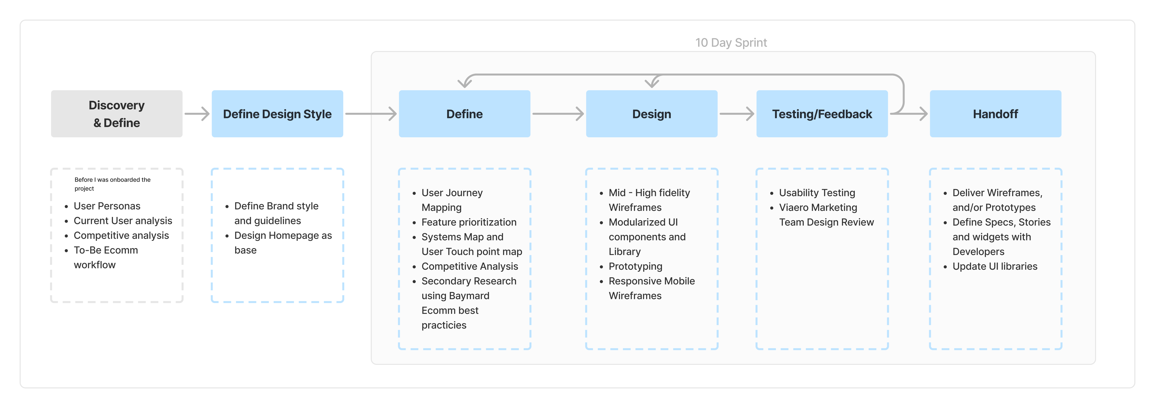
Research & Define
Understanding our users, existing fragmented system, and competitors
Defining Customer Journey, System ingegration needs, Features and priotizations
1. Understanding the fragmented backend services and processes
2. Hard Deadline
With the holiday sales season fast approaching, the client wanted to take advantage of online sales. This helped us prioritize features & parking lot complex features and iteratively build a solution.
3. Competitive Analysis
Analyzing other telecom's plan selection and checkout journeys, we generated insights of pros and cons of each and how our client can stand out for better service
4. Secondary Research
Used Baymard reports to identify industry and checkout specific user needs and best practices
5. Starting to Map
Gathering information from Viaero's technical and marketing departments, and using insights from the above steps we mapped a user journey.
Solutions
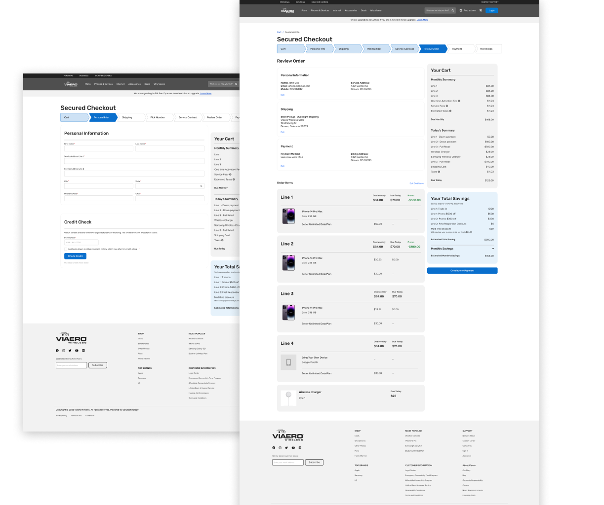
Progress Bar
Added a responsive stepper to guide users through the steps needed to complete the checkout process. This is version 1 of stepper approved by the client to be improved upon in future to reduce steps to 4 to 5 only by some added technical efforts on the backend to merge these and added efforts from Viaero to reduce form fields required.
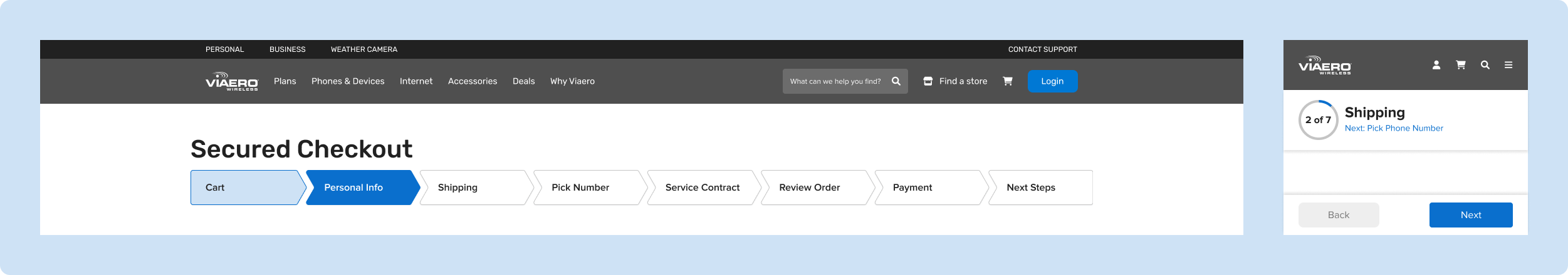
Choosing Multi-step over prior Single-page checkout layout
- Baymard's checkout usability report showed no significant difference in single-page vs multi-step layout given best practices for each form field and structure were followed.
- Complex nature of Viaero's checkout flow, high support needed from third-party tools
Neha Patil
UX Researcher & Designer